Design Support Library (IV): Collapsing Toolbar Layout

One of the most amazing things about Design Support Library is that we can create lively animated UIs with some simple configuration in XML. No code nor deep control about scrolls is required, so the process becomes really easy.

We saw that Coordinator Layout is the central point the other components rely on to work properly, and that AppBarLayout helps the toolbar and other components to react to scroll changes. Today, I’ll show you how to use Collapsing Toolbar Layout to create awesome effects in a very easy way.

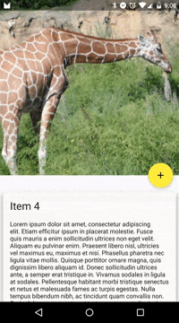
If you remember, I was changing my MaterializeYourApp repository code to start using the Design Support Library. Today I’ll change the detail screen, and we’ll get something like this:

Collapsing Toolbar Layout

Add a Coordinator Layout

This is the first thing you need. All the new components use a new concept called Behavior that is used by the Coordinator Layout to take some actions based on different interactions.

[xml]
<android.support.design.widget.CoordinatorLayout
xmlns:android="http://schemas.android.com/apk/res/android"
xmlns:app="http://schemas.android.com/apk/res-auto"
android:layout_width="match_parent"
android:layout_height="match_parent"
android:fitsSystemWindows="true">

</android.support.design.widget.CoordinatorLayout>
[/xml]

We’ll be using fitsSystemWindows on any item we want to be painted below the status bar.

Add an App Bar Layout

[xml]
<android.support.design.widget.CoordinatorLayout
xmlns:android="http://schemas.android.com/apk/res/android"
xmlns:app="http://schemas.android.com/apk/res-auto"
android:layout_width="match_parent"
android:layout_height="match_parent"
android:fitsSystemWindows="true">

<android.support.design.widget.AppBarLayout
android:id="@+id/app_bar_layout"
android:layout_width="match_parent"
android:layout_height="wrap_content"
android:theme="@style/ThemeOverlay.AppCompat.Dark.ActionBar"
android:fitsSystemWindows="true">

</android.support.design.widget.AppBarLayout>

</android.support.design.widget.CoordinatorLayout>
[/xml]

Nothing difficult here either. We’re setting a dark theme for the AppBarLayout, that way we don’t need to specify to every children that it should use a dark theme.

Add a Collapsing Toolbar Layout

[xml]
<android.support.design.widget.CoordinatorLayout
xmlns:android="http://schemas.android.com/apk/res/android"
xmlns:app="http://schemas.android.com/apk/res-auto"
android:layout_width="match_parent"
android:layout_height="match_parent"
android:fitsSystemWindows="true">

<android.support.design.widget.AppBarLayout
android:id="@+id/app_bar_layout"
android:layout_width="match_parent"
android:layout_height="wrap_content"
android:theme="@style/ThemeOverlay.AppCompat.Dark.ActionBar"
android:fitsSystemWindows="true">

<android.support.design.widget.CollapsingToolbarLayout
android:id="@+id/collapsing_toolbar"
android:layout_width="match_parent"
android:layout_height="match_parent"
app:layout_scrollFlags="scroll|exitUntilCollapsed"
app:contentScrim="?attr/colorPrimary"
app:expandedTitleMarginStart="48dp"
app:expandedTitleMarginEnd="64dp"
android:fitsSystemWindows="true">

<com.antonioleiva.materializeyourapp.SquareImageView
android:id="@+id/image"
android:layout_width="match_parent"
android:layout_height="wrap_content"
android:scaleType="centerCrop"
android:fitsSystemWindows="true"
app:layout_collapseMode="parallax"/>

<android.support.v7.widget.Toolbar
android:id="@+id/toolbar"
android:layout_width="match_parent"
android:layout_height="?attr/actionBarSize"
app:popupTheme="@style/ThemeOverlay.AppCompat.Light"
app:layout_collapseMode="pin" />

</android.support.design.widget.CollapsingToolbarLayout>

</android.support.design.widget.AppBarLayout>

</android.support.design.widget.CoordinatorLayout>
[/xml]

That’s the core part of this article. First, the collapsing layout specify how it will behave when the content is scrolled using the flags scroll|exitUntilCollapsed, so it will scroll until it’s completely collapsed. Then we specify the contentScrim, which is the color the toolbar will take when it reaches it’s collapsed state. I’ll be changing this programmatically and use palette to decide its color. We can also specify the margins for the title when it’s expanded. It will create a nice effect over the toolbar title. You can define some other things, such as the statusScrim or the textAppearance for the collapsed and expanded title.

Inside the layout I added an image, with a parallax collapse mode, and a toolbar, which uses a pin toolbar mode (it will stick to its position).

Add a Nested Scroll View

The rest of the XML just consists of adding a NestedScrollView. It’s an special scroll view which can be inside another scrolling ViewGroup. That way, we can see a continuity when scrolling.

[xml]
<android.support.v4.widget.NestedScrollView
android:id="@+id/scroll"
android:layout_width="match_parent"
android:layout_height="match_parent"
android:clipToPadding="false"
app:layout_behavior="@string/appbar_scrolling_view_behavior">

</android.support.v4.widget.NestedScrollView>
[/xml]

As you can see, you need to specify this view is the one App Bar will use to decide how to transform its content.

Anchor the Floating Action Button

We can use CoordinatorLayout to anchor some views to others. That’s an extremely useful feature. Besides, FloatingActionButton behavior also will pay attention to AppBarLayout changes, and will hide when it collapses. So another nice effect for free:

[xml]
<android.support.design.widget.FloatingActionButton
android:id="@+id/fab"
app:layout_anchor="@id/app_bar_layout"
app:layout_anchorGravity="bottom|right|end"
style="@style/FabStyle"/>
[/xml]

Nothing else is needed. You can see the complete XML at Github.

Some code tweaks

Now everything should be working, but I added some code that will tint the toolbar using palette, or will help with material transitions.

An important thing to know about the latter point is that we cannot use the image as the transition target. For some reason it won’t work. After trying some different options I found that the one that works best is targeting the AppBarLayout:

[java]
ViewCompat.setTransitionName(findViewById(R.id.app_bar_layout), EXTRA_IMAGE);
[/java]

We also need to set the Collapsing Toolbar Layout title programmatically. I also set the expanded color for the title to transparent, because it was interfering with the transition. Besides, it creates a nice alpha effect:

[java]
collapsingToolbarLayout = (CollapsingToolbarLayout) findViewById(R.id.collapsing_toolbar);
collapsingToolbarLayout.setTitle(itemTitle);
collapsingToolbarLayout.setExpandedTitleColor(getResources().getColor(android.R.color.transparent));
[/java]

I’m also tinting the toolbar and the FAB using Palette. I won’t get into details about this, but you can check the code for more details:

[java]
collapsingToolbarLayout.setContentScrimColor(palette.getMutedColor(primary));
collapsingToolbarLayout.setStatusBarScrimColor(palette.getDarkMutedColor(primaryDark));

fab.setRippleColor(lightVibrantColor);
fab.setBackgroundTintList(ColorStateList.valueOf(vibrantColor));
[/java]

Conclusion

With some simple steps, now we have an amazingly animated detail screen that includes most of the things we’ve seen in Material Design specs. We can customize this in many ways really easily, and even manage some more complex effects by creating custom behaviors, which is what we’ll see in next article. You can subscribe to the blog feed to stay tuned.

73 thoughts on “Design Support Library (IV): Collapsing Toolbar Layout”

    1. Yeah, Header won’t scroll. But you can implement your gesture listener to do this on image or wherever you are receiving the touch events.

  1. How to make the collapsing of the toolbar more smooth while scrolling? If i do a fling gesture then the scrolling kinda stops.If you notice the playstore it has a smoother scrolling & collapsing.

    1. Antonio Leiva

      Because they don’t use this library. I don’t think there’s a way to fix that for now, it stops when the NestedScrollView reaches its top.

  2. Unfortunately there is an issue with this whole setup: IMM keyboard will obscure buttons/views if you have a NestedScrollView with a form (EditTexts for example) below the toolbar. I have tried many different workaround – including setting weight of NestedScrollView to 0 – which fixes the keyboard issue, but makes the CollapsingToolbarLayout overlap on top of the scroll view. Have you any ideas about this issue?

  3. Thanks for the tutorial! Am having issues when there is not enough content in the nested scroll view though, then the scrolling goes crazy. Any idea how to fix that without adding dummy content?

    1. I am having the same issue, and i haven’t found any solution yet. If someone has a workaround please let us know.

  4. one minor note, you can actually remove fitsSystemWindows from everything except for the top level (CoordinatorLayout). the behavior of fitsSystemWindows is to stop at the first “true” it encounters – from the documentation: “This function’s traversal down the hierarchy is depth-first. The same content insets object is propagated down the hierarchy, so any changes made to it will be seen by all following views (including potentially ones above in the hierarchy since this is a depth-first traversal). The first view that returns true will abort the entire traversal.”

    1. Antonio Leiva

      Thanks for your comment, it’s something I didn’t have very clear, to be honest. We all learn from each other 🙂

  5. I used this collapsing toolbar layout with Recycler View as a child of CoordinatorLayout, the problem I was facing was that when i was down the layout after collapsed toolbar it wasn’t smooth.It behaves like sticky toolbar even if dragging down.

  6. I found also another bug with this library and is that you can scroll (and get a weird result) even if the Scrollable content (the included into the NestedScrollView) is “smaller” than the available space in this view. In other words, in many cases you can scroll even if there’s no need to scroll.

    1. Same problem. Seems to be sporadic. Definitely the library and nothing I’m doing. If I turn on Show Layout Bounds I can see that the fault lies in the library. Wish there’d be a workaround for this. Users probably aren’t going to like it.

  7. if FloatingActionButton set app:layout_anchor=”@id/app_bar_layout” , sharedElements tansition does not work on it

  8. On the Collapsing toolbar on the contacts app, the Contact name appears bigger at the bottom of the picture and as you scroll it gets smaller on to the toolbar. On this example it isn’t working. Any tips to how make it show?
    Here is an image example of what I’m trying to say. https://goo.gl/3rZJNu

    1. Antonio Leiva

      This example really does what you need, though you probably don’t see it because the text starts transparent. Try to remove this line in DetailActivity.java:
      collapsingToolbarLayout.setExpandedTitleColor(getResources()
      .getColor(android.R.color.transparent));

      You can also change the expandedTextAppearance to make it bigger for instance. Play with that, you’ll probably get what you want.

  9. Hi,

    how can i set sub title with title below collepsingToolbar title like whats app group Toolbar

    Thanks in advance

  10. I have done the same way, I have two problems. First, Scrolling down (towards last content) is not smooth at all, it kinda hangs but while coming back to top its very smooth. Second, if i scroll slowly before my Toolbar pin at top (before reaching the top) the background image fades and the Toolbar totally becomes visible. So this happening before toolbar fit into its original position! Any Solutions?

  11. Hi Antonio, this was a well explained sample and tutorial. Is it possible anyhow, to put not only images, but general layouts with general views e.g. TextViews, Buttons or anything to the collapsing toolbar. I’m trying to create an user account view, in a collapsing fashion, with textviews showing user properties, so I need to bind views and set texts. Static xml-s works fine the layout collapses nicely, as soon as I bind the views the collapsing toolbar get a solid color and nothing is shown. Here are two screenshots. https://db.tt/4LBE7mfP and https://db.tt/8Arz6YYk which shows the behaviour

  12. Can anyone tell me where i can found complete code, as there are some properties which are handled through .java which are more not mentioned in this page.

    Thanks…….

  13. I am also having the scrolling issue when I have small content it is not working smoothly but when I have large content than it is working perfectly fine. Any suggestion what should I do ?

  14. Thank you for great tutorial!

    Do you know, can another element be used instead of image, for example mapFragment or mapView?
    Can’t find any information about it.
    Thanx!

  15. Hi, I have followed your tutorial. It works fine but the only issue is when i scroll up the NestedScrollView,it is Sluggish and gets struck at the top and the collapsing toolbar doesnt expands. Upon scroll up in the second try after reaching the top of NestedScrollView ,collapsing toolbar comes out.
    Please help me(i am using no toolbar and scrolls flag being exitUntilCollapsed)

    1. Yeah, that’s a known CollapsingToolbarLayout limitation. There are several threads in StackOverflow talking about it. Just google “CollapsingToolbarLayout fling”.

  16. Hi Antonio,

    So i followed this tutorial and was able to get it working quite well except for two issues,

    i implemented this as a fragment which is called in a FrameLayout in another Activity..

    while implementing , to test, i added multiple textview in a linearlayout as a dummy – text within the nestview. While i’m okay with the scrolling performance as of now, i do observe that when i first run the app, all the textView’s text appear to the left edge. when i checked the layout bounds, i realized, the entire view was not matching the parent inspite of the attribute being set to match_parent. (it matches to the linearlayout’s width.) When i rotate the device, the views are centered and it seems fine.

    second,
    after the first scroll down to the last textview, and i scroll up.. any gesture/touch event on the image itself causes the app to crash.

    any idea why this is happening?

    Thanks

  17. I have a question:
    Suppose I don’t need collapsing toolbar, but I do need something like a header to a recyclerView, is it possible to add one ? Maybe using NestedScrollView?

  18. Can i make this, but the Collapsing Toolbar Layout to be on the bottom?
    So, when i drag the Collapsing Toolbar Layout from the bottom to top, the SquareImageView to expand.
    Just like in your example, but the Colapsing Toolbar to be down.

    1. Hi! I’m a bit late to the party but I’m curious if you have found the solution to this?
      I have read through a ton of examples and didn’t find anything useful 🙁

  19. I would like to extend it with following feature:

    The ImageView is full screen height and at activity starts it is automatically scrolled half of it height down. When activity starts and user will scroll down, it will behave the old way, but (at activity starts) when he scrolls up, he can scroll all the way up to make the image full screen height size.

    What kind of steps I need to take to make it behave the way I imagined?

  20. Thanks for the tuto and for the source on github.
    Do you have any idea why the compiled app from github has the fling bug whereas the app on the play store doesn’t ?
    Thanks !

    1. Antonio Leiva

      Because the one in the Play Store is using an old code where I implemented the animation myself. The one from Github is using the design support library.

  21. Hello Antonio!

    First of all I would like to thank you for this support. I implemented your sample code in my app but still i need some more functionality. So i want to know that is there any possibility to add sub-title and more resources to CollapsingToolbarLayout like WhatsApp. Or is there any other way to get it. Because i tried it by adding more resources below Toolbar but it didn’t show any animation effect when i scroll, however i am adding property to “pin” or “parralax” it works with that only.

  22. Hello Antonio! This is the best tutorial I have found so far. I wanted to use “app:behavior_overlayTop” attribute on NestedScrollView. If I add that attribute on nestedscrollview, it is overlapping the collapsing toolbar as expected. Is there a way to set that attribute to nestedScrollView programmatically? I want to have that behavior available on first time scroll movement.
    Thanks.

  23. Hi guys, I have a problem.
    When I give a slap back to the top of the list collapsing toolbar not automatically expands.
    I need the collapsingtoolbar has the same behavior playstore

  24. Antonina Tkachuk

    I seem to not understand exitUntilCollapsed flag. In this blog post, it’s stated that this flag will move all the content up – https://guides.codepath.com/android/Handling-Scrolls-with-CoordinatorLayout – “exitUntilCollapsed: When the scroll flag is set, scrolling down will normally cause the entire content to move:”, but in your example and many others I’ve found, the toolbar always stays at its place. Also, when I run the source code from guides.codepath.com, the Toolbar stays at its place. So, how it should behave? 🙂 Thanks!

    1. “exitUntilCollapsed” will just make the CollapsingToolbarLayout smaller and smaller while scrolling until the size is the same as the regular toolbar. The toolbar won’t get out of the screen completely, it will just collapse. Not sure if that answers your question.

  25. Everything works fine… but my problem is how to change the actual color into transparent of status bar… because it always show the dark theme color….

  26. Hello how to cretae designign first linearlayout add all icon from top part and after display the fullscreen 300dp and after display tablyout

    please check the layout.
    if possible

Comments are closed.