· 4 min read
Design Support Library (II): Floating Action Button

If you already read the first article regarding Navigation View, you may be wondering what else the new Android Design support library can do for you. In this occasion, I´ll talk about Floating Action Button.
Introduction
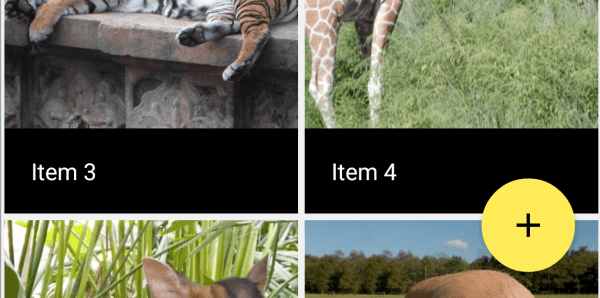
The Floating Action Button (FAB) is a new component included in Material Design guidelines that emphasizes the most important action in our current screen. It´s a bold and stylish way to attract users’ attention.
Though there is an enormous hype surrounding this component, it´s really important to create FABs only when they are really necessary, and when they show an action that it´s gonna be used quite often (ideally, all the times the activity is shown). It´s interesting to read other voices that affirm FABs are a bad idea.

Using Floating Action Button
The use of FAB is really simple, though this component has brought some debate these days after the launch of the design library, because some things didn´t work as expected.
I´ll show you the general behaviour, and then some ideas you might take into account to make it work properly.
First, the only thing you need is use a FloatingActionButton, which extends ImageView, so many of the things you know about that control will be helpful. This is the way you add it to your XML:
<android.support.design.widget.FloatingActionButton
    android:id="@+id/fab"
    android:layout_width="wrap_content"
    android:layout_height="wrap_content"
    android:src="@drawable/ic_add_black"
    android:layout_gravity="bottom|end"
    app:elevation="6dp"
    app:pressedTranslationZ="12dp"/>
As you see, I only added an icon, an elevation (so that it shows a shadow) and a pressedTranslationZ; that way the shadow will grow when it´s pressed. A nice effect, and really easy to add this way. I also added some gravity flags to set it in the bottom right part of the screen. This is supposing you use a FrameLayout. You can adapt it to the layout you use.
Extra options
Those previous customizations are the simplest ones. The FAB will take the color from the accent color defined in the theme, and the ripple color from the colorControlHighlight, though all these things are customizable.
For the background color you could do:
app:backgroundTint="@color/mycolor"
And for the ripple:
app:rippleColor="@android:color/white"
You also have methods available to do all this programmatically, but the backgroundTint is a bit more difficult because it uses a state list, so this is the way to go (thanks Carlos Morera for the tip):
fab.setBackgroundTintList(ColorStateList.valueOf("Your color"));
There are two different sizes of FAB available, and it´s easy to get the mini version just by adding another property:
app:fabSize="mini"
Cautions
Although these things will probably be fixed in future, here are a couple of tricks to make FAB work as expected. First, if you run previous code, you´ll find a lot of different unexpected behaviours depending on the Android version you are using. All of these problems seem to be caused by a property called borderWidth, which you need to set explicitly to 0:
app:borderWidth="0dp"
Besides, you will see that with this XML, pre-Lollipop versions will get some margin around, while 21+ won´t get it. The reasoning is the same as what you could see on CardView: Shadows on pre-Lollipop are rendered using a drawable, which uses its own space to draw it, while the shadows in Lollipop are rendered by the system. CardView had a property that enabled a compat padding.
But Floating Action Button doesn´t. However, this is really easy to simulate. Just add a padding that is dependent on the Android version:
android:layout_margin="@dimen/fab_compat_margin"
You now only need to define the value on its proper dimen.xml files.
For values:
app:borderWidth="0dp"
For values-v21:
app:borderWidth="16dp"
Easy, right?
Click Event
You can add a click event as usual:
fab.setOnClickListener(new View.OnClickListener() {
    @Override
    public void onClick(View v) {
        Snackbar.make(content, "FAB Clicked", Snackbar.LENGTH_SHORT).show();
    }
});
Conclusion
Though the impression when using Design Support Library is that it is not perfectly polished, it´s true that with some simple tricks it works quite good and saves a lot of time. I´ll keep investigating new components on future articles. Remember you can see all this code and much more in a small working example at Github.
The team from Webucator has created a video from this article. Take a look!
[youtube=https://youtu.be/eaG47lMQsUY]
Thanks for reading.


