· 5 min read
Branded launch screen: the new splash for Android

Talking about splash screens in Android has always been rather controversial. On one hand, you can find marketing teams and customers, avid of showing their branding. They will always request a splash that takes a couple of seconds and shows some logo or beautiful art.
On the other hand, UX teams, developers, and, in general, people with some knowledge about mobile platforms will be reluctant to show it. The reason is quite simple to understand: if you need to show a two-second splash, the user interaction with the App will be delayed for (at least) two seconds. And provided we use mobile Apps for a few seconds and close them, a couple of seconds are a total waste of time.
But in the latest Material Design specs update, splash screen came back (almost officially) to Android.
Branded Launch Screen
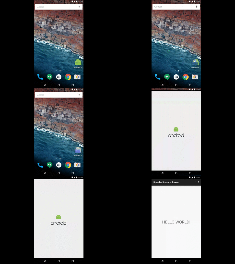
Material design specs now include a section called launch screens, which talks about a kind of branded alternative called Branded Launch Screen. This could resemble a little to those splashes we Android developers and users hate, but they have a slight difference: the screen will be shown for initial launch from the home screen if the App takes long to initialize.
What does it mean? During the transition since the App is closed and until it is initialized and ready to inflate its first view, the only thing we can see is the window background defined by the theme of the launch activity. It will usually be a light gray or dark plain background. Why not using this time to show your logo instead?
The controversy
There have been some debates on the Internet about it. Juhani Lehtimäki started a really interesting conversation about it. I recommend reading to take your own conclusions. This new screen resembles a lot to the old splash screens and I understand the reluctance to any similar pattern.
Some of the arguments against it are that these screens are hiding a real problem, which is that applications do too many things when they start, and this splash wouldn’t be necessary in a well implemented app. While this is true, and the efforts should be focused in reducing this time as much as possible, nowadays apps usually need to initialize many things when they start running: an analytics system, probably a crash reporting system, and even some libraries which require some startup configuration (such as Dagger, which needs to create its graph), and this time is really difficult to reduce. I’ll also show in the following example that even an app that does nothing takes an appreciable time to start.
There is also a concern about delaying the interaction of the user more than necessary. I totally agree with that; anything that increments the time the user needs to wait to start using the App is not a good idea. But if the launch screen is implemented this way I’m showing you next, it won’t be adding any delay to the interaction.
The implementation
They way to implement this screen is really easy once you understand a couple of things. The first one (I already mentioned it): what the screen shows before it is able to start inflating the UI is the window background that the theme of the launch activity specifies. So the first thing we need is a special theme for the launch activity:
<style name="AppTheme" parent="Theme.AppCompat.Light.DarkActionBar" />
<style name="AppTheme.BrandedLaunch" parent="AppTheme">
    <item name="android:windowBackground">@drawable/branded_logo</item>
</style>
And now a drawable that shows the logo. If you remember, you can’t use an image directly into the background because it will stretch to fit the whole screen. But we can use a layer drawable with a background and a centered bitmap:
<layer-list xmlns:android="http://schemas.android.com/apk/res/android">
    <item>
        <color android:color="@color/background_material_light" />
    </item>
    <item>
        <bitmap android:src="@drawable/launch_logo_image"
                android:tileMode="disabled"
                android:gravity="center" />
    </item>
</layer-list>
And now you can assign this theme to the main activity:
<activity android:name=".MainActivity"
          android:label="@string/app_name"
          android:theme="@style/AppTheme.BrandedLaunch">
</activity>
The trick to hide it is to change our theme to the original one right before the MainActivity inflates its UI. That way the background logo is hidden and you show the content at the very moment the App is ready:
@Override
protected void onCreate(Bundle savedInstanceState) {
    setTheme(R.style.AppTheme);
    super.onCreate(savedInstanceState);
    setContentView(R.layout.activity_main);
}
You can compare both App starts and decide by yourself. If you want to see it in action, you can download the code from its Github repository.

Conclusion
While I’m not saying all the apps should implement this new branded launch screen, I think that showing a logo instead of a blank screen during the time we can’t interact with the App is not a bad idea. If the app is simple and it starts almost immediately, I probably wouldn’t use it because the time the brand is on the screen is almost unappreciable. But nowadays apps are more and more complex and can require some small time to initialize, so showing a logo in the meanwhile can be a good alternative.
You can try the code and play with it by downloading it from the Github repository.

