· 3 min read
Design Support Library (I): Navigation View
Google I/O 2015 has brought a whole new set of tools for Android Developers which are meant to make our lives easier. I´d like to devote a set of articles to talk about the incredibly useful Design Support Library.
Though there is a good example from Chris Banes at Github, I´d like to talk a little deeper about each new features while migrating the example app Materialize Your App, which you can find at Github
Navigation View
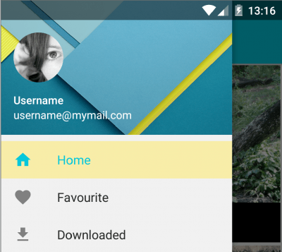
In this article, I´ll start talking about the Navigation View. Since Material Design was released, we were given a standard definition on how a Navigation Drawer must look and feel.

Truth is that implementing those guidelines was rather time consuming. But now, with the navigation view, the implementation is much easier.
How Navigation View works?
You´d basically add it in the same position previously used for your custom view, inside a Drawer Layout. The Navigation View will receive a couple of parameters, and optional layout for a header, and a menu that will be used to build the navigation options. After that, you will only need to add a listener to capture selection events.
Implementation
First of all, we´re creating the menu. It´s quite straightforward, you just need to create a group and say only one item can be checked at the same time:
<menu xmlns:android="http://schemas.android.com/apk/res/android">
    <group android:checkableBehavior="single">
        <item android:id="@+id/drawer_home" android:checked="true" android:icon="@drawable/ic_home_black_24dp" android:title="@string/home"/>
        <item android:id="@+id/drawer_favourite" android:icon="@drawable/ic_favorite_black_24dp" android:title="@string/favourite"/>
        ...
        <item android:id="@+id/drawer_settings" android:icon="@drawable/ic_settings_black_24dp" android:title="@string/settings"/>
    </group>
</menu>
Theoretically, you can also add sections with headers by adding a submenu to an item, something like this:
<item android:id="@+id/section" android:title="@string/section_title">
    <menu>
        <item android:id="@+id/drawer_favourite" android:icon="@drawable/ic_favorite_black_24dp" android:title="@string/favourite"/>
        <item android:id="@+id/drawer_downloaded" android:icon="@drawable/ic_file_download_black_24dp" android:title="@string/downloaded"/>
    </menu>
</item>
This will create a divider and a header, and will add the items right below. However, I couldn´t find a way to mark any of those items as checked. I´ll update this lines if I come up with a solution. Anyway, I encourage you to try it and see how it works.
Now, we can add a navigation view to our activity layout and set the menu and the header layout. I won´t talk here about the header, because it can be any layout you want, but you can check an example at the Github repo.
<android.support.v4.widget.DrawerLayout xmlns:android="http://schemas.android.com/apk/res/android"
    xmlns:app="http://schemas.android.com/apk/res-auto"
    xmlns:tools="http://schemas.android.com/tools"
    android:id="@+id/drawer_layout"
    android:layout_width="match_parent"
    android:layout_height="match_parent"
    android:fitsSystemWindows="true"
    tools:context=".MainActivity">

    <FrameLayout android:id="@+id/content" android:layout_width="match_parent" android:layout_height="match_parent" android:orientation="vertical">
        ...
    </FrameLayout>

    <android.support.design.widget.NavigationView
        android:id="@+id/navigation_view"
        android:layout_width="wrap_content"
        android:layout_height="match_parent"
        android:layout_gravity="start"
        app:headerLayout="@layout/drawer_header"
        app:menu="@menu/drawer"/>
</android.support.v4.widget.DrawerLayout>
Our last step will be the Java code. First you need to enable home as up:
final Toolbar toolbar = (Toolbar) findViewById(R.id.toolbar);
setSupportActionBar(toolbar);
final ActionBar actionBar = getSupportActionBar();
if (actionBar != null) {
    actionBar.setHomeAsUpIndicator(R.drawable.ic_menu_black_24dp);
    actionBar.setDisplayHomeAsUpEnabled(true);
}
Next, initialize the navigation drawer. When an item is selected, it shows a snackbar (I´ll talk about it in next articles), selects the clicked item and closes the drawer:
drawerLayout = (DrawerLayout) findViewById(R.id.drawer_layout);
NavigationView view = (NavigationView) findViewById(R.id.navigation_view);
view.setNavigationItemSelectedListener(new NavigationView.OnNavigationItemSelectedListener() {
    @Override public boolean onNavigationItemSelected(MenuItem menuItem) {
        Snackbar.make(content, menuItem.getTitle() + " pressed", Snackbar.LENGTH_LONG).show();
        menuItem.setChecked(true);
        drawerLayout.closeDrawers();
        return true;
    }
});
And finally, open the drawer when the menu action is pressed:
@Override
public boolean onOptionsItemSelected(MenuItem item) {
    switch (item.getItemId()) {
        case android.R.id.home:
            drawerLayout.openDrawer(GravityCompat.START);
            return true;
    }
    return super.onOptionsItemSelected(item);
}
Conclusion
Now it´s really easy to create a navigation drawer that meets Material guidelines thanks to the use of the design support library and the Navigation View. Next articles will cover some other new elements that will help us create user interfaces in a faster and easier way. You can move to the next article about Floating Action Button now. Remember you can see all this code in a small working app example at Github.


