· 4 min read
Material Design Everywhere: Using AppCompat 21
We were all hoping that the new support APIs included Material Design, the new theme adopted since Android 5.0 Lollipop. And it luckily happened: this new theme is included in AppCompat 21. So be aware that if you are using it for previous projects, the transition won’t be straightforward.
If you want to know more about this topic, I have another article from a talk and a more complex example in another repository on Github. Enjoy!
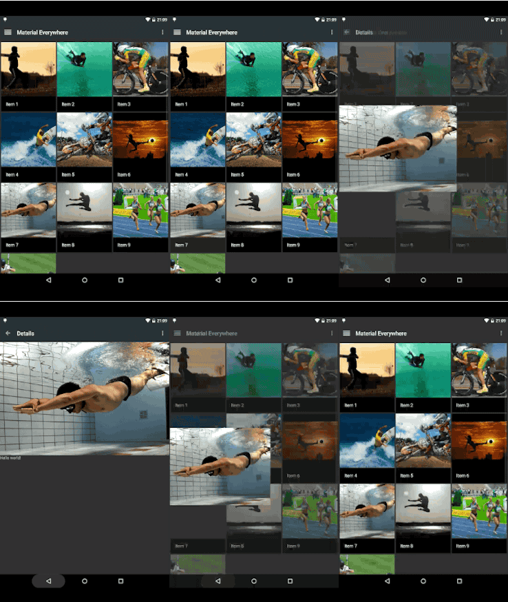
Anyway, in this post I want to give you the most basic tools to create an app that uses Material as its main theme, and functional from API 7. I’m not getting into details on how to take the most out of this theme (that will require some extra tutorials), but to get it prepared to work backwards, even with transitions functional in Lollipop.
One minor clarification: Lollipop transitions are not backwards compatible, so at the moment you won’t be able to see those smooth transitions in pre-21 devices.
Setting up your project
First, you will need to create a new project and set ActionBar compatibility, even if you are only supporting 14+ devices. The Material theme is included in it. Set the compile sdk version to 21. Your build.gradle should be something like this:
android {
    compileSdkVersion 21
    buildToolsVersion "21.0.0"

    defaultConfig {
        applicationId "com.antonioleiva.materialeverywhere"
        minSdkVersion 14
        targetSdkVersion 21
        versionCode 1
        versionName "1.0"
    }
    ...
}

dependencies {
    compile fileTree(dir: 'libs', include: ['*.jar'])
    compile 'com.android.support:appcompat-v7:21.+'
}
Specify the Material Theme
It’s now important that your theme extends Theme.AppCompat. Now, the AppCompat Theme includes everything you need to support Material Design in previous versions. You will see that I’m using a Base theme and overriding the final theme in values-v21. This is because I want that Lollipop uses its nice transitions.
values/themes.xml
<?xml version="1.0" encoding="utf-8"?>
<resources>
    <style name="AppTheme" parent="AppTheme.Base"/>

    <style name="AppTheme.Base" parent="Theme.AppCompat">
        <item name="colorPrimary">@color/colorPrimary</item>
        <item name="colorPrimaryDark">@color/colorPrimary</item>
        <item name="android:windowNoTitle">true</item>
        <item name="windowActionBar">false</item>
    </style>
</resources>
values-v21/themes.xml
<?xml version="1.0" encoding="utf-8"?>
<resources>
    <style name="AppTheme" parent="AppTheme.Base">
        <item name="android:windowContentTransitions">true</item>
        <item name="android:windowAllowEnterTransitionOverlap">true</item>
        <item name="android:windowAllowReturnTransitionOverlap">true</item>
        <item name="android:windowSharedElementEnterTransition">@android:transition/move</item>
        <item name="android:windowSharedElementExitTransition">@android:transition/move</item>
    </style>
</resources>
We set some primary colors and remove the ActionBar. We don’t want to show the ActionBar because there is a new substitute in the game: the Toolbar. I will talk about it a bit later.
You just need to set the theme in the AndroidManifest.xml.
<application ... android:theme="@style/AppTheme">
    ...
</application>
Setting the Toolbar
The toolbar is basically what we were used to know as the ActionBar. The most important difference is that this toolbar is now part of our layout, so that we can play with it in any way we consider: animations, drawer overlay, etc.
This is basically what we need to add to our layouts. It may be interesting to create it in a separate layout and include it in the other ones:
<android.support.v7.widget.Toolbar
    xmlns:android="http://schemas.android.com/apk/res/android"
    android:id="@+id/toolbar"
    android:layout_width="match_parent"
    android:layout_height="wrap_content"
    android:background="?attr/colorPrimaryDark"/>
So how does it change our way to work with the toolbar? Almost everything will be the same, we just need to remember to notify the Activity that this toolbar will be its ActionBar. Don’t forget that your activities must extend ActionBarActivity.
@Override
protected void onCreate(Bundle savedInstanceState) {
    super.onCreate(savedInstanceState);
    setContentView(getLayoutResource());
    Toolbar toolbar = (Toolbar) findViewById(R.id.toolbar);
    if (toolbar != null) {
        setSupportActionBar(toolbar);
    }
}
And that’s it, now you can set your menu, title and the rest of ActionBar properties using the methods you already know. I find it useful to create a BaseActivity which is in charge of doing this task, and make the other activities extend this one.
You can now add a navigation drawer, and you will see that the drawer appears over the toolbar, just as the google design guidelines recommend.
Lollipop Activity Transitions
As I mentioned before, transitions are not available in pre-21 devices, so we need a way to overcome this issue. The support library provides a good set of compatibility classes that will help us use these new features with less code. This is a typical move transition, in which some shared elements are animated into the new activity:
ActivityOptionsCompat options = ActivityOptionsCompat.makeSceneTransitionAnimation(
    activity,
    transitionView,
    DetailActivity.EXTRA_IMAGE);
ActivityCompat.startActivity(activity, new Intent(activity, DetailActivity.class), options.toBundle());
That’s nice. With ActivityCompat and ActivityOptionsCompat we don’t need to check the device version and our code will be cleaner.
Conclusion
With these simple steps, we are now prepared to start an Android app using Material Design and the new Toolbar. There is much left to explain about the Material theme and how to configure it, but this is a good first step into the new era of Android design.
You can see a working example in this project in my Github.
